
Psychology of Colour in the Workplace
Everyone is different, so its stands to reason the psychological effect of colours on people would vary, depending on their life experiences and culture. However, research shows that colours can actually have the same general affect on the majority of people.
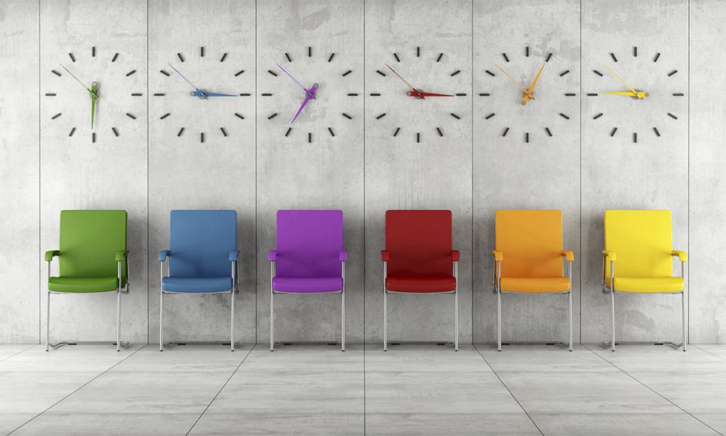
Red: Physical
This colour can give off feelings of excitement, anger and strength. It is strong in both its pro’s and con’s as it depends on the subjects mood. The colour gives a great sense of warmth and movement.
Blue: Calm
A popular colour amongst most. Blue can create feelings of trust, serenity and reflection. The coolness of the colour tends to sooth and calm the people around it. We tend to have a more emotional reaction to this colour as opposed to the physical reaction we have to red.
Green: Balance
A refreshing colour which we associate with nature, rest and equilibrium. Green brings on a sense of peace within us as we create that link to the environment. It allows people to think clearly and focus.
Purple: Spiritual
This colour, like blue, tends to have an emotional affect on people. It can seem very spiritual and truthful with a hint of warmth to it. We can be easily pleased by this colour and it can allow us to feel creative.
Orange: Playful
Orange has a bright, fun element to it. This colour is enthusiastic and passionate! A good colour to use in a space where people do not spend long periods of time. It can become frustrating and overpowering when seen too much of.
Pink: Elegance
Stereotypically known as a very feminine colour. Pink actually has many beneficial effects on people. It can lessen feelings of irritation and aggression and replace these feelings with positive, tranquil emotions. The elegance of the colour has a vibrant, playful element to it – reflecting this on people in its presence.
Grey: Neutral
Grey is seen by most people as a very neutral, dull colour. And so it has quickly become known as being very boring and draining. It lets off a feeling of simplicity and so can easily be ignored or blend in. Depending on the shade and depth of grey there can be many different feelings brought out from it.
Black: Strength
When used in the right space black can be a stunning, bold statement colour.
It gives a sense of sophistication and substance.
However, when used too much or in the wrong space it can become domineering and heavy. Using black as a feature is a great way to add a bit of essence to the energy in a room.
White: Purity
Known for its pros and cons – white can create a light, spacious and fresh feel in a space. But when used completely on its own it tends to create more of a sterile coldness. The simplicity of white is beautiful as it allows people to feel clear, pure and fresh. It can be used in large doses with a splash of colour to bring it to life.
This connection between colour and people gives us a tool for creating different moods in different spaces.
Change colours from space to space to bring out desired behaviors and feelings, and give people the opportunity to really connect to a space.

By Nicky Richter
Nicky is a Senior Interior Designer, previously with Fuze Business Interiors – currently, traveling the world! For questions relating to this article please contact us on Ph.09.3091710